Now that we have assembled and cleaned our data, we will answer these questions in our followup to the Denied series:
Has the percentage of special education students in Texas changed since the benchmarking policy was dropped?
How many districts were above that arbitrary 8.5% benchmark before and after the changes?
How have local districts changed?
Setup
Before we proceed further, we need to run packages in our Console and include the libraries listed below.
library(tidyverse)
── Attaching core tidyverse packages ──────────────────────── tidyverse 2.0.0 ──
✔ dplyr     1.1.4     ✔ readr     2.1.5
✔ forcats   1.0.0     ✔ stringr   1.5.1
✔ ggplot2   3.5.1     ✔ tibble    3.2.1
✔ lubridate 1.9.3     ✔ tidyr     1.3.1
✔ purrr     1.0.2
── Conflicts ────────────────────────────────────────── tidyverse_conflicts() ──
✖ dplyr::filter() masks stats::filter()
✖ dplyr::lag()    masks stats::lag()
ℹ Use the conflicted package (<http://conflicted.r-lib.org/>) to force all conflicts to become errors
library(janitor)
Attaching package: 'janitor'

The following objects are masked from 'package:stats':

    chisq.test, fisher.test
library(scales)
Attaching package: 'scales'

The following object is masked from 'package:purrr':

    discard

The following object is masked from 'package:readr':

    col_factor
library(DT)
Import the cleaned data
Let’s import the cleaned data and simply call it “sped” for future referral
The way our data is formatted now, it’s difficult to see the percentage of special education students for each district for each year. We can format the columns to show up differently by pivoting the table wider.
To make the table searchable, we can apply a function called datatable().
district_percents_data |>datatable()
Data Takeaway: Between 2013 and 2016, Austin ISD traditional public schools maintained a steady 10% of students who were in enrolled in special education programs. In 2017, when Texas outlawed a restrictive benchmark for the accepted enrollment percentage, the district saw an uptick. Austin ISD now hosts approximately 14% of students in special education programs, with an overall increasing trend throughout the years.
Getting yearly percentages
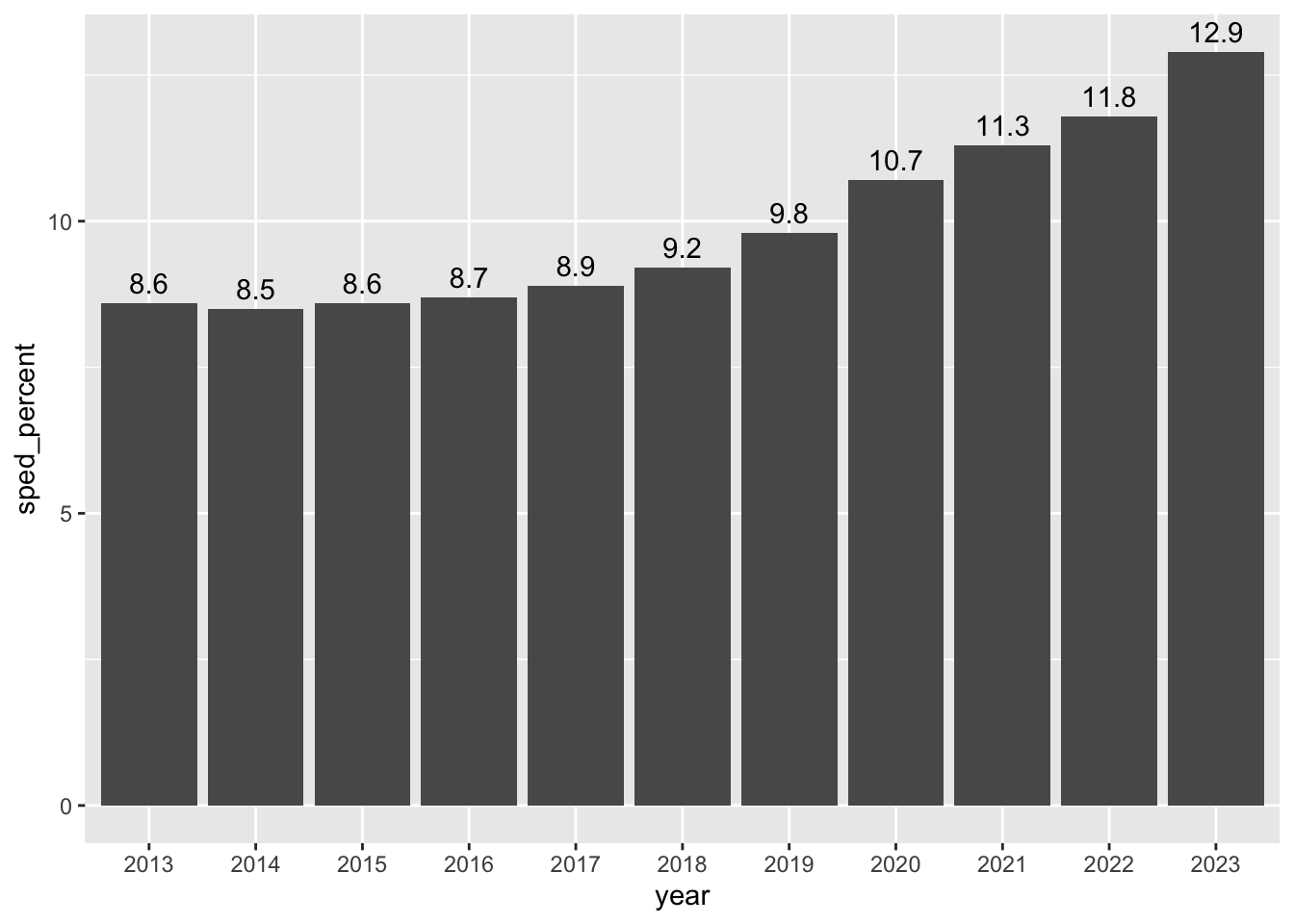
Our first question about this data was this: Has the percentage of special education students in Texas changed since the benchmarking policy was dropped? One way to visualize the change is to chart the yearly percentages within districts.
Data Takeaway: Since the benchmark for special education students in traditional public schools was outlawed in 2017, the percentage of students within these programs increased, reaching as high as 12.9% in 2023 compared to the previous 8.5% standard.
District benchmarks
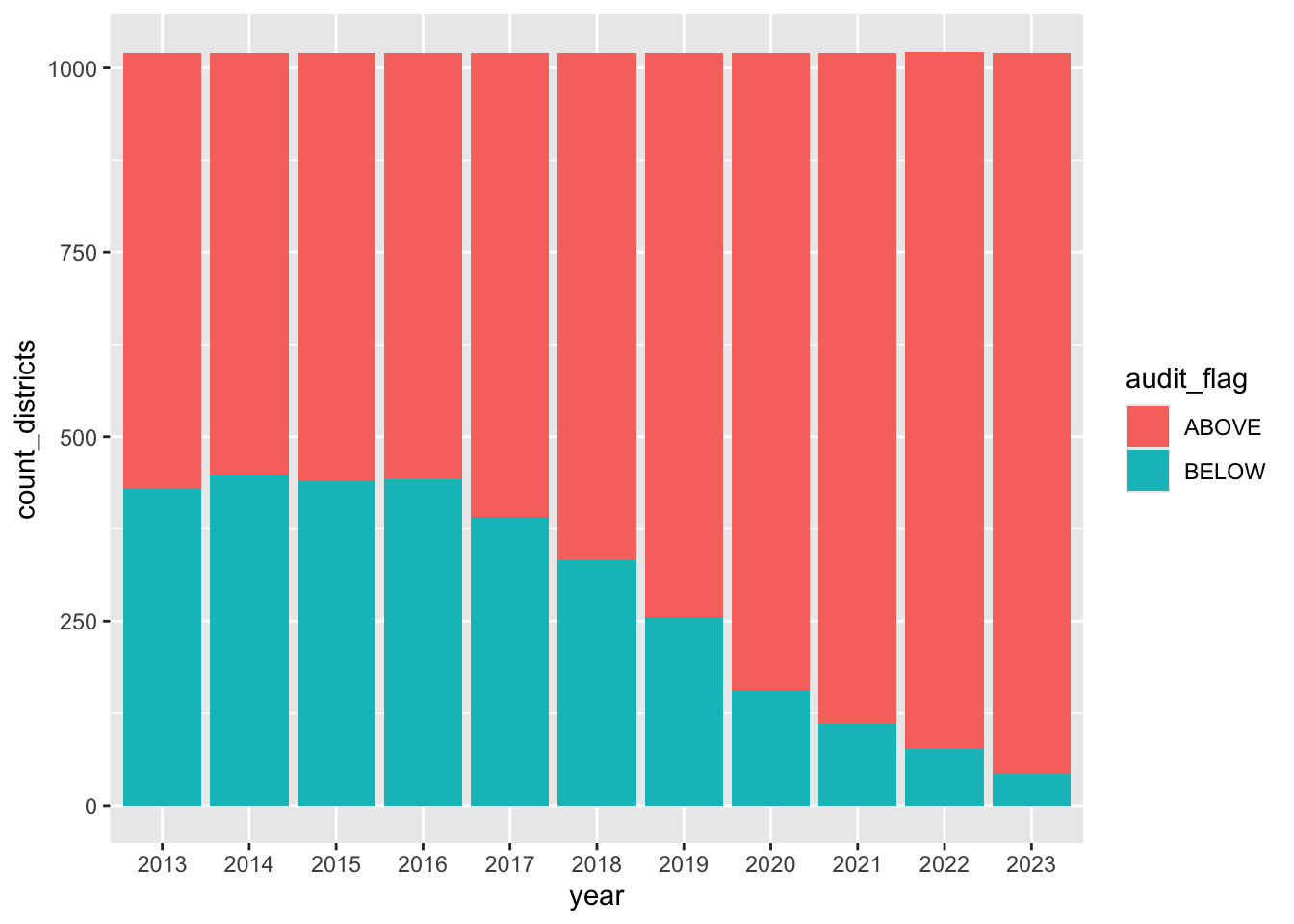
Our second question is this: How many districts were above that arbitrary 8.5% benchmark before and after the changes? The logic is this: We need to group our data by both the year and the audit_flag, and then count the number of rows for those values.
`summarise()` has grouped output by 'year'. You can override using the
`.groups` argument.
flag_count_districts
Now that we have the data, we can build the ggplot column chart. The key new thing here is we are using a new aesthetic fill to apply colors based on the audit_flag column.
flag_count_districts |>ggplot(aes(x = year, y = count_districts, fill = audit_flag)) +geom_col()
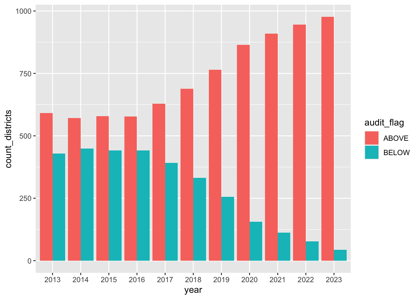
Leave that chart there for reference, but let’s build a new one that is almost the same, but we’ll adjust it to be a grouped column chart instead of stacked. The key difference is we are adding position = “dodge” to the column geom.
flag_count_districts |>ggplot(aes(x = year, y = count_districts, fill = audit_flag)) +geom_col(position ="dodge")
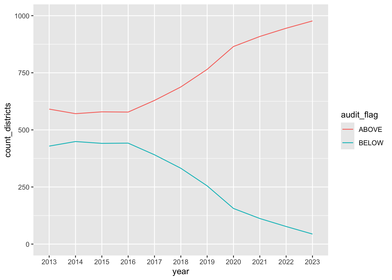
Lastly, let’s chart this data as a line chart to see if that looks any better or is easier to comprehend.
flag_count_districts |>ggplot(aes(x = year, y = count_districts, group = audit_flag)) +geom_line(aes(color = audit_flag)) +ylim(0,1000)
Data Takeaway: Compared to 2013 when the special education benchmark was still in effect in Texas public schools, the number of districts above the arbitrary 8.5% benchmark increased from 591 to 977 across the state.
Local districts
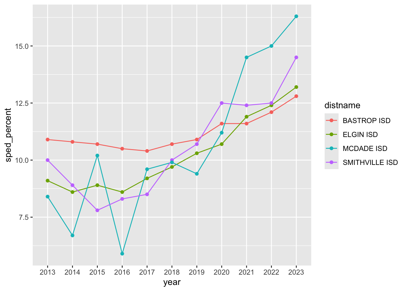
We have one last question: How have local districts changed? i.e., what are the percentages for districts in Bastrop, Hays, Travis and Williamson counties? We want to make sure none of these buck the overall trend.
sped |>filter(cntyname =="BASTROP") |>ggplot(aes(x = year, y = sped_percent, group = distname)) +geom_line(aes(color = distname)) +geom_point(aes(color = distname))
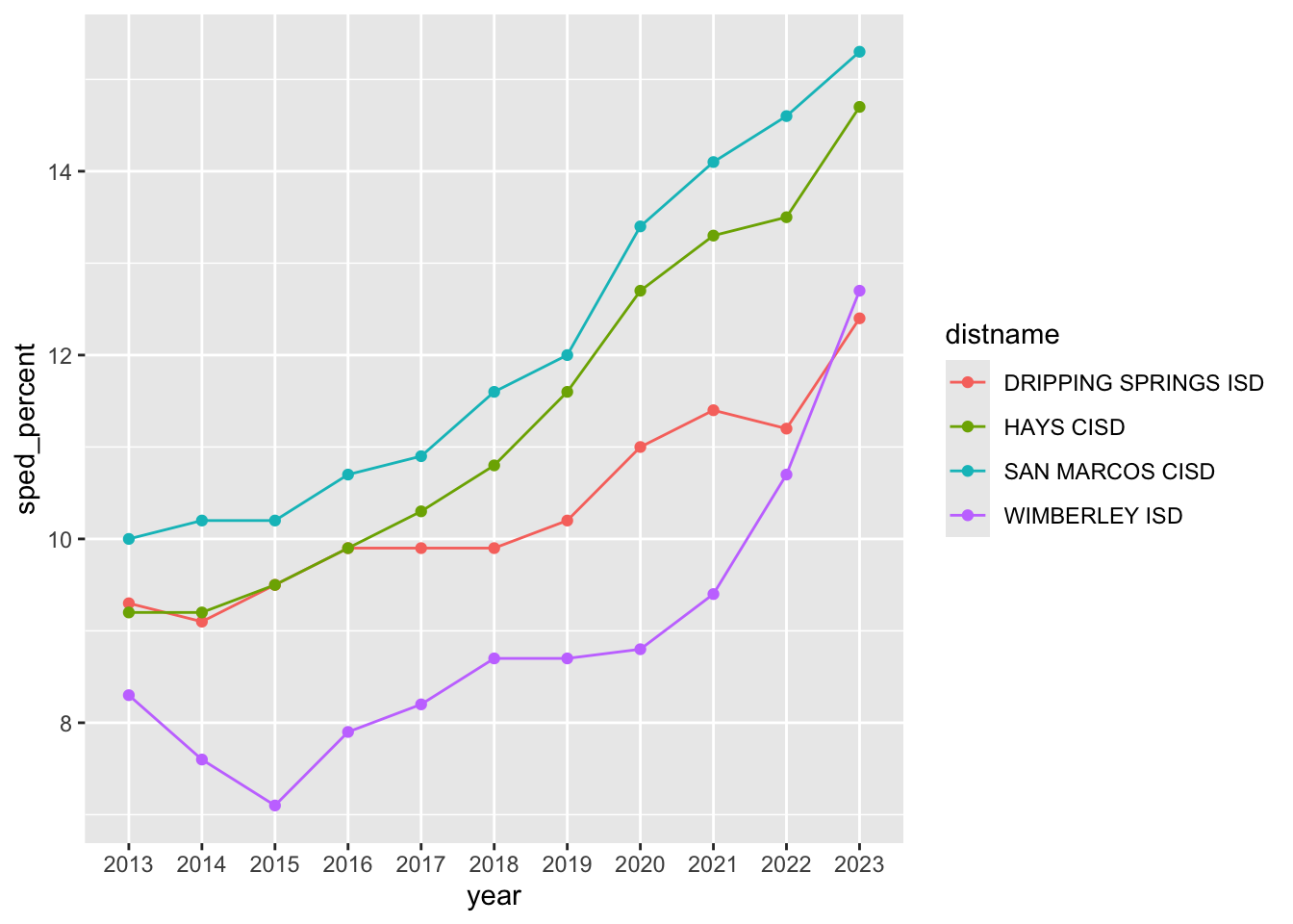
Here are more visualizations for other three counties, starting with the result for Hays:
sped |>filter(cntyname =="HAYS") |>ggplot(aes(x = year, y = sped_percent, group = distname)) +geom_line(aes(color = distname)) +geom_point(aes(color = distname))
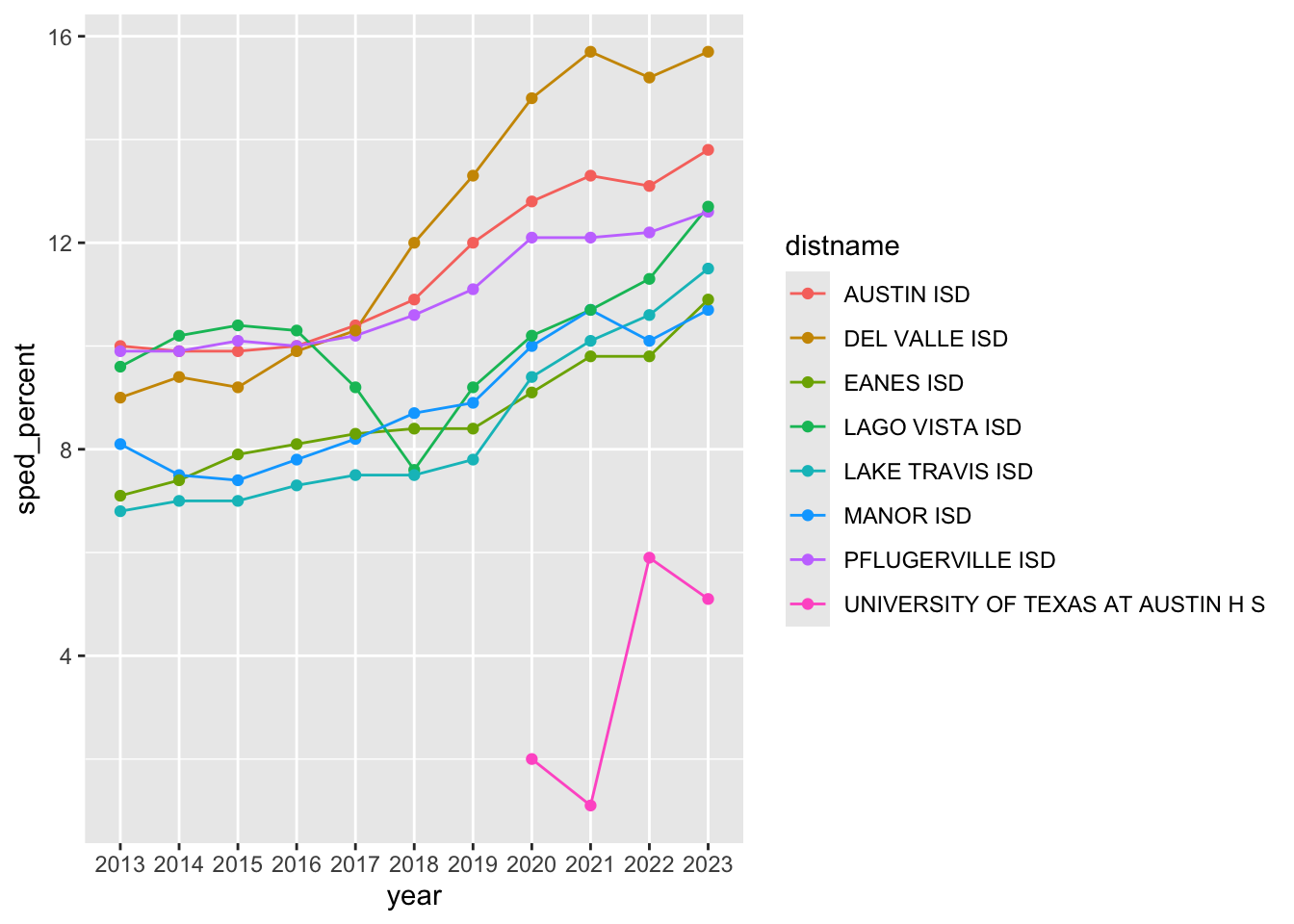
Onto Travis:
sped |>filter(cntyname =="TRAVIS") |>ggplot(aes(x = year, y = sped_percent, group = distname)) +geom_line(aes(color = distname)) +geom_point(aes(color = distname))
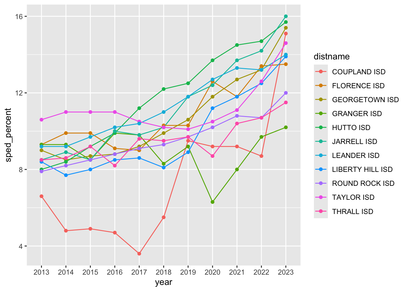
And lastly, Williamson:
sped |>filter(cntyname =="WILLIAMSON") |>ggplot(aes(x = year, y = sped_percent, group = distname)) +geom_line(aes(color = distname)) +geom_point(aes(color = distname))
Data Takeaway: Upon examination of the Hays, Travis and Williamson school districts, interesting trends regarding percentages of special education students emerge. During the COVID-19 pandemic, for example, several schools in Williamson county saw a downward trend in percentages despite the lifted restriction, whereas enrollment in Hays and Travis country districts continued to grow.
OYO: Datawrapper
As the final endeavor, I will pivot an existing data set to make it applicable for Datawrapper visualizations based on Travis county percentages. I removed the column that included the University of Texas at Austin High School since it was discontinued in 2023.
The final line graph that I created can be found here.
datawrapper_travis <- sped |>filter(cntyname =="TRAVIS") |>select(distname, year, sped_percent) |>pivot_wider(names_from = distname, values_from = sped_percent) |>select(!'UNIVERSITY OF TEXAS AT AUSTIN H S')datawrapper_travis |>write_csv("data-processed/datawrapper_travis.csv")datawrapper_travis